Are you looking to make your resume to stand out? Surprisingly, it’s the little details that can make the biggest differences. Making a statement with a professional resume font choice can help you perfect your resume presentation, layout and structure and can leave a great impression on your hiring manager.
Not sure where to start? Below we’ve put together 30 of the best resume fonts so that you can stand out from the crowd and make a great first impression.
01. Gill Sans
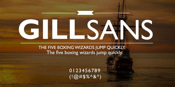
This British-designed Serif presents a classic and clean text, perfect for any resume. The font works well with both small and large font sizes, making it easy to adjust to suit the amount of information you want on your resume. Since it’s standard weight it’s a little thicker than the average font, yet perfect to make the statement you need.
02. Didot
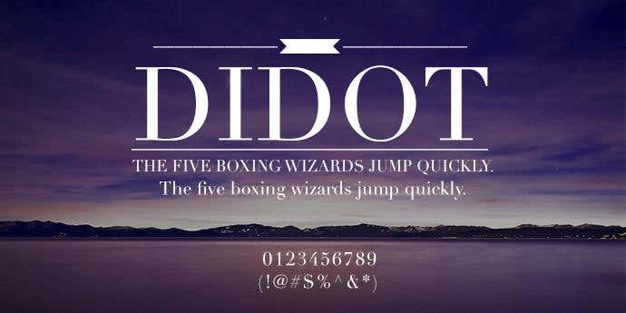
Didot is a professionally presented font, which derived its name from a French printing and type producing family, who were among the first to set up a printing press in Greece.The typeface with its tall stems, gracefully transitioning into thin hairlines, creates a natural fluency to the text. If you’re looking for elegance, this is your go to font.
03. Avenir
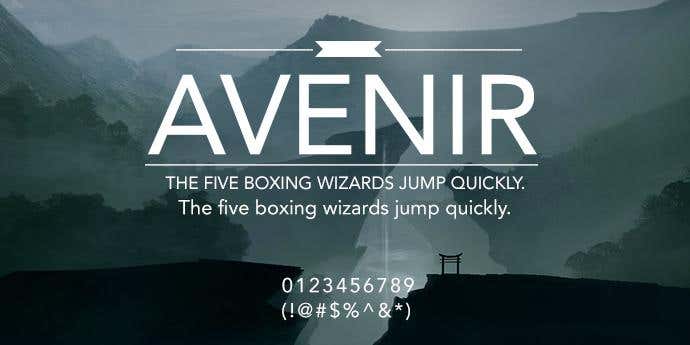
With evenly distributed thickness across its text, Avenir is a clean and neat san-serif font. It is geometrically proportional and has a variety of weights you can use to separate your resume. If you’re looking for a modern touch to your document, this is the design for you.
04. Bodoni MT
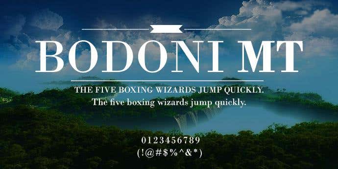
This strong font has a smooth transition between thick and thin strokes, creating personality to any text. It works best with thick spacing and larger print in order to bring out its classic characteristics. On a resume it is best left for titles or subheadings to break up the structure of the document.
05. Cambria
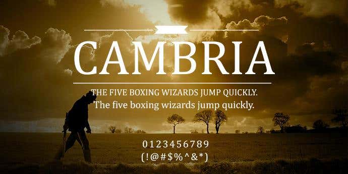
You may be familiar with the font due to its popular distribution across Microsoft Office and Windows programs. It was created by a dutch designer for the use of body texts both on-screen and off-screen. This serif font has high legibility both with small texts on paper and low resolution on screen, perfect for your resume!
06. Lucida Sans
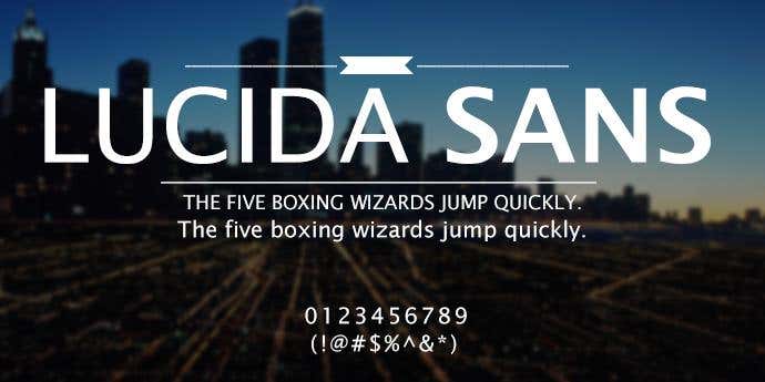
This classic font uses a large x-height and open counters to produce a well legible font. If you’re using a larger font size, reducing your letter spacing also can present professionally to your hiring manager. This font works well for titles and headings used to separate your resume.
07. Garamond 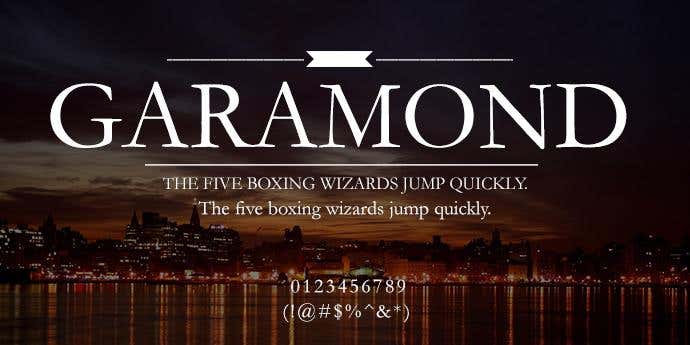
As a timeless and long-standing serif, this font has been remodeled and improved to serve as an effective text for your resume. It’s characteristically small eye of the ‘e’ and bowl of the ‘a’, help fit a large amount of text on the page and maintaining legibility. If you’re looking to keep your style simple and sophisticated, this is perfect resume font for you.
08. Georgia
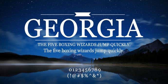
With alternating thick and thin strokes, a larger than normal x-height and it’s blacker than normal bold, this resume font has personality and clarity. It is easy to read on all sizes and all resolutions and will complement your resume both on-screen as a soft copy or a hard copy on paper.
09. Proxima Nova
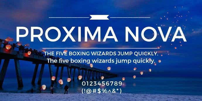
This geometric font, uses softened edges and rounded curves to create a subtle gentle tone to the text. This typeface is available in eight weights and three different widths, providing great variety to your resume.
10. Computer Modern
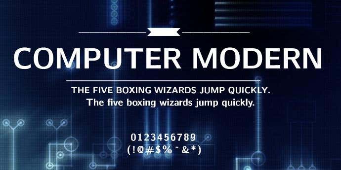
You may have seen this modern serif font widely used across scientific documents and publishing as it has an effective contrast between thick and thin strokes. It is also effective for mathematical use due to its large size for creating legible base letters.
11. Basic Sans
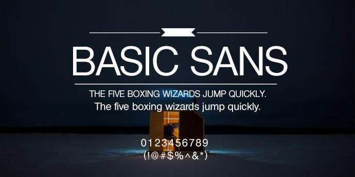
With an evenly maintained weight across all its lettering and well balanced counters, this resume font is simple and neat. You really don’t need much more than simple for your resume and Basics Sans provides this legibility with a touch of character.
12. Trebuchet MS
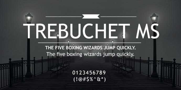
Designed for Microsoft Corporation in 1996, this resume font is a humanist sans-serif. It takes inspiration from traditional letterforms such as those seen on ancient Roman buildings. Keeping it simple and neat, this font enhances the content of your resume and provides good presentation.
13. Optima
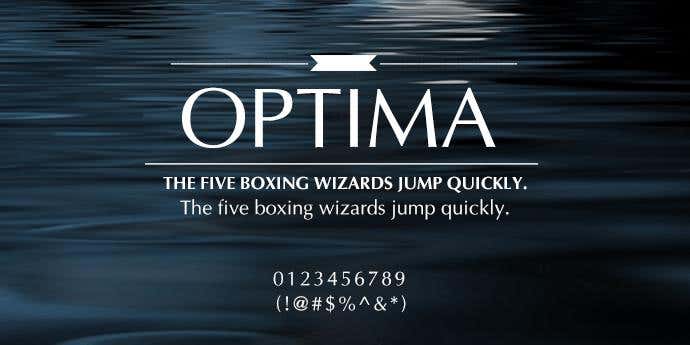
This humanistic san serif typeface was inspired by Roman and Italian stone carving. Its open counters and fluent transition between thick and thin strokes create a traditional yet graceful tone to the text. This font is ideal to add a touch of professionalism to your resume!
14. Palatino Linotype
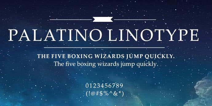
This resume font comes from the old-style Palatino serif typefaces, inspired by the effects of a broad nib pen. Palatino Linotype adds a modern touch to traditional this traditional style. It is widely used across modern versions of microsoft software. If you are looking for a modern feel of a traditional style, this is the font for you.
15. Futura
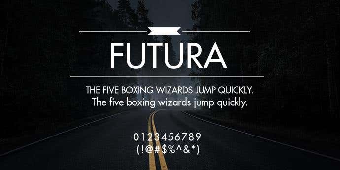
Futura is a geometrical typeface designed in 1927 that uses a uniform thickness spread evenly across its text. This resume font creates neat and effective text, useful for both the body and headlines of your resume. This simple yet relaxed style adds a unique touch to your document.
16. Univers
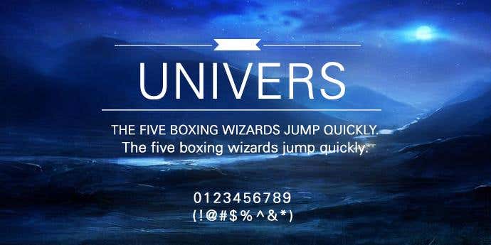
Univers is a neo-grotesque font that uses solid and bold designs, ideal for headlines. It is also noted for its availability in a range of weights and styles, making it suitable for use across your entire resume. This typeface was designed by Adrian Frutiger who has become one of the most notable designers of the 20th century.
17. Lucida
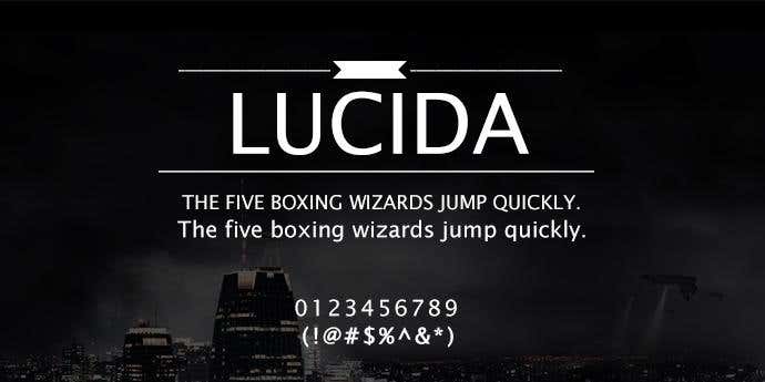
This ‘lucid’ font, as its name Lucida suggests is ideal for small print and low-resolution screens. This makes this typeface ideal for body texts and resumes intended for print or on screen as this clear, ‘lucid’ and simple design has great legibility. This resume font is available in a variety of styles to suit your resume character.
18. Minion
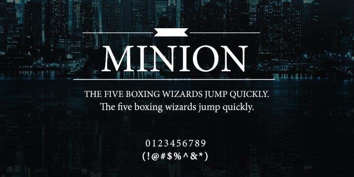
You might recognise this font if you’re an attentive book reader. As one of the most popular choices for books, this font is clear and legible for continuous text, making it ideal for a professional touch to your resume.
19. Lato
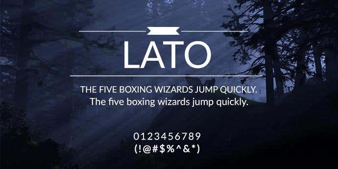
Lato means ‘summer’ in Polish and like its name suggests, it evokes a fresh and friendly design that works well with continuous text. Its soft rounded curves, contrasts with its sturdy structure, creating stable and strong letters that are legible across a range of sizes.
20. Baskerville
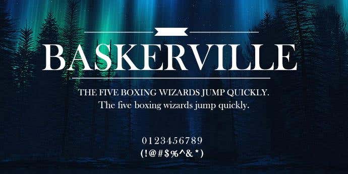
This traditional font designed in the 18th century was intended to revolutionise the typical old-style typeface. This was achieved as the contrast between thick and thin strokes is increased, the counters are rounded and the ascenders and descenders are more aligned. If you are looking for a modern touch on a very old-style text to add character to your resume, this is the font for you.
21. Century Gothic
This resume font has strong influence from the font Futura, however with a higher x size, giving it a rounder and more playful feel. The large, round counters enhance its legibility through a range of sizes, while maintaining character and interest with the reader.
22. Book Antiqua
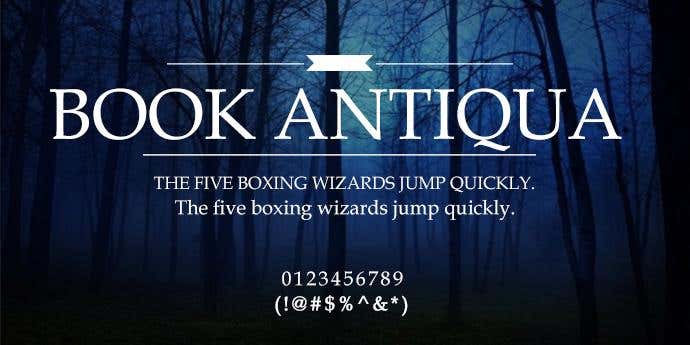
Gentle and soft on the eye, this resume font draws inspiration from the pen-drawn letters of the Italian Renaissance. With clearly printed letters and a graceful fluency, this texts offers a distinctive feel to the resume, which could set yours apart from the crowd. It is also available in italics.
23. Arial
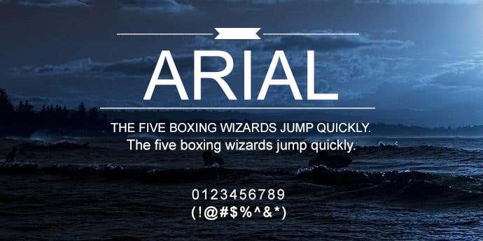
Arial is a well-known san-serif typeface and often the go-to choice for your word document. Its popularity isn’t without reason, as it boasts clarity and legibility and will work well across your entire resume.This resume font is available in a range of styles and weights.
24. Bell MT
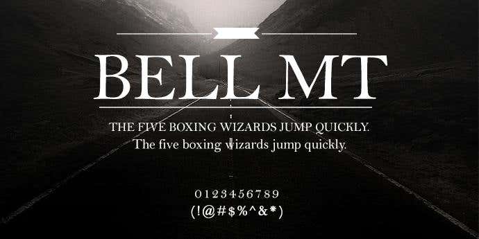
Using a combination of traditional old-style characteristics, this resume font offers a more modern look of rounder counters and softer curves. This blend of thin hairlines and soft curves creates a distinctive style. There has been modifications to this typeface over the years, giving it a greater range and usefulness.
25. Bookman Old Style
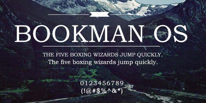
You might have seen this style around as it is extensively used in headlines and advertising. This serif typeface inspired by Old Style Antique typeface and maintains an even and regular alignment. Its straighter and more rigid complexion makes this resume font ideal for headlines and also maintains legibility in continuous text.
26. Goudy Old Style Regular
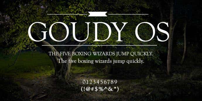
This classic text, is characteristical of an old-style serif font and is renowned for its legibility. It boasts gentle curves and rounded serifs to add a graceful touch to the text. If you’re looking for traditional fluency to add character to your resume, this is the style for you.
27. Constantia
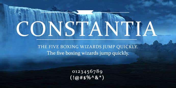
This modern font, associated with the ClearType Font Collection, was designed primarily for continuous texts. It uses a rounder typeface to create a style that’s a little more fun and relaxed compared to your usual design. These open counters also play a practical role by ensuring legibility, regardless of the text size.
28. Droid Serif
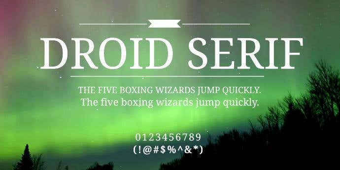
This resume font is a contemporary serif that can effectively fit a significant amount of text on the page. It high x-size makes for comfortable reading on-screen and good legibility on paper. This style has a relatively straight design while maintaining a fun and distinct appearance.
29. Tahoma
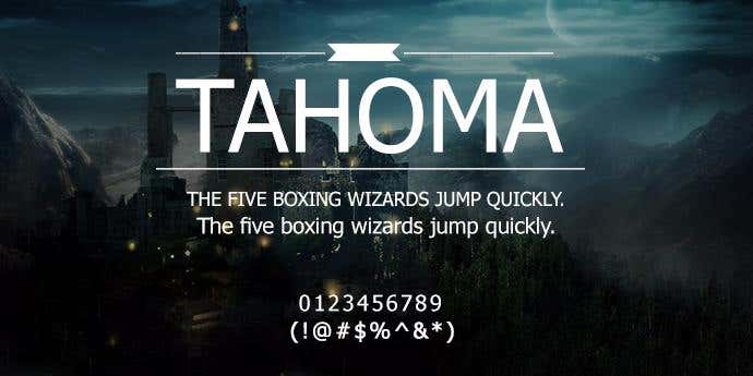
This humanist san serif was designed for the Microsoft Corporation by Mathew Carter. The resume font has a narrow body, with small counters and tight lettering space. This style is well suited for on screen display, making it ideal if you were to send a PDF copy or digital format of your resume.
30. Verdana
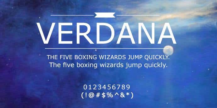
Sharing the same designer as Tahoma, it was similarly designed for the Microsoft Corporation. Unlike its cousin, this resume font has a wider body, larger counters and greater lettering space. It has high legibility at small sizes and makes for a clean and neat body text for your resume.
How to create a unique font
Featuring a great font in your designs can change the tone of your messages with your readers. Struggling to find a great font? Why not have one created for you!
The process is super easy!
Simply post a contest and you’ll receive different font designs from experts all over the world. You can give feedback and chat with the freelancers about their designs and any changes you were thinking of making.
Then, when the contest is finished, award the contest prize to the designer of your favourite font, and the Intellectual Property of that design is transferred to you.
So what are you waiting for? Post a contest on Freelancer today!