Are you looking to make that ultimate first impression? A well designed email signature can be a great way to showcase your professionalism when you communicate with customers, clients or businesses online. As you close your email, you want to be able to capture your reader’s attention and stay memorable in the minds of your target audience.
An email signature can be a useful promotional tool for your business, website, blog, book or personal cause. So what makes an email signature design outstanding? There are several elements and tips you can apply to creating memorable signature styles. Let’s take a look at some awesome design tips and examples below!
1. Showcase your brand colors
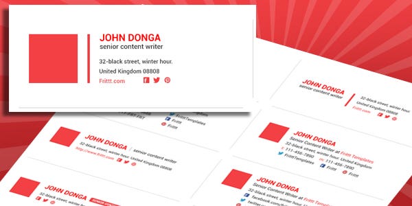
There’s no better way to make a statement with your brand than by using bold brand colors in your email signature design. However it’s important to remember the important do’s and dont’s. Try to avoid avoiding overcrowding your email signature with too much colour and graphics. Instead, choose one or two key colours and combine them to showcase your brand colour combinations.
2. Use a snapshot of yourself

A great way to highlight your personal brand is by including a professional snapshot of yourself in your email signature design. Choose your background color palette carefully so that it complements your photograph without overpowering it. A great photo is one that best captures you professionally.
3. Highlight your social media

Can your business be reached on social media? If so, then it may be a good idea to include your social media links in your email signature design. By showcasing your social media in your email signature, you are inviting your readers to get to know more about you and your business. Not sure where to start? Including social media icons in your email is a great way to capture the attention of your readers.
4. Keep your information clear

An email signature should be clear and simple, a reference for your readers to go back to if they need to contact you. The more information you include, the more confusing it may get. Adding two emails and three phone numbers is a sure way to confound the reader. Which email address should they reply to? Which phone number is best to call you on? Nobody wants to have to make these unnecessary decisions. Make it easier for your reader to get in touch with you by including only a clear address and phone number.
5. Incorporate a slogan
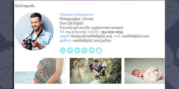
Do you have a slogan that encapsulates what your brand is all about? If you do, consider it a must-have element of your email signature. When you insert your company slogan together with your logo, your reader will make an immediate connection, which is sure to be unforgettable.
6. Showcase your information with a bold banner

If you are looking for something bold, using a bright colored banner to house all of your contact details can be a great way to get your reader's attention in your email signature. This works well to emphasize the kind of industry you are in. For example, a green band may highlight your sustainable business, while a blue band works well for a more corporate feel.
7. Monochromatic is memorable

Not a fan of bright colours? No problem! You can always choose to opt for a black and white email signature design. Black and white is a universal option and can be used to represent any business or cause. The iconic colour combination is a great statement piece that adds sophistication and class to any email signature design.
8. Let your logo take center stage

Your logo is often the first impression you can make to your customers and is the face of your company. Incorporating your logo into your email signature design and allowing it to take centre stage, is a great way to leave a lasting impression on your customers. If your logo features a bright colour, it may be a good idea to complement and mirror this colour with your font.
9. Apply a gridline design structure
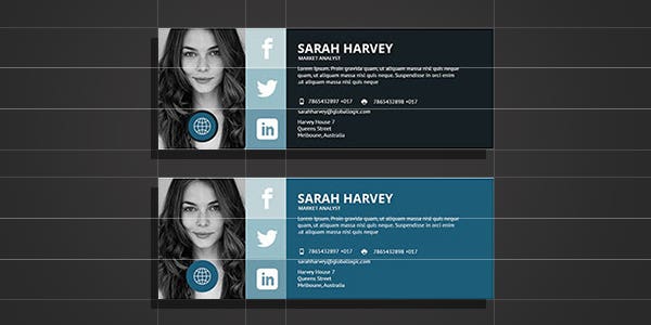
Using a gridline design in your email signature is a great way to organise your content for your readers. Aligning each element of your email signature allows for much more clean and crisp design that will be easier on the eye. After all, who want to look at disorganised and cluttered designs?
10. Include your signature

Looking to add a personal touch to your email signature? The best way to do this is by incorporating your very own signature. While all other elements such as fonts, colors and graphics, can be found elsewhere on the web, a signature is unique and 100% you!
11. Get creative
Getting creative and adding a funny punchline in your email signature can be a unique way to create a memorable impression on your readers. Of course, this may not work if you are trying to portray a serious business image, but it is a great way to bring a smile to the face of the reader.
12. Showcase your name

An important element to any email signature design is showcasing your name. It can be easy for your name to be overshadowed by other graphics and information in the email. Using a larger font size relative to the other information featured in your email signature can mean that your name will stand out and your readers will not forget it.
13. Incorporate multiple elements

While less is usually more, when it comes to incorporating elements into your email signature, there are ways that you can incorporate multiple elements and still keep it stylish and simple. This example features a snapshot, brand colors and a unique signature without completely overpowering the design - a great diverse and balanced email signature!
14. Keep it modern
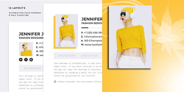
If you’re in the creative industry, it may be best to showcase your abilities in a modern email signature. Consider bold colours, quirky designs and stylish fonts to story tell to your readers. Your readers will have a clearer understanding of what it is that you do and what your business represents.
15. Apply a minimalistic design

A clean minimalistic design that incorporates a simple logo, contact information and job title are sometimes all you need to promote your brand and business. Keeping your email signature design simple will mean that your information is presented clearly for your readers and your contact information will be much more organised.
16. Use animated gifs
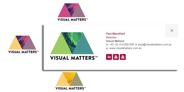
Animated gifs can be a great way to grab your reader's attention and showcase your business logo. In saying this, you do not want to distract the reader too much or create any confusion in the message you are trying to convey in your email signature. You want the reader to stay focused on your message. Animated gifs should be subtle so they emphasize your business and promote your personal brand.
17. Use a playful design layout
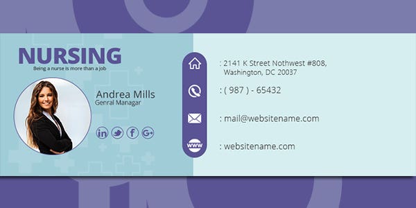
Changing up the structure of your email signature can be a great way to add diversity to your designs and capture the attention of your readers. A colored background in your email signature design also offers a nice balance between creativity and the information presented.
18. Include links to your business
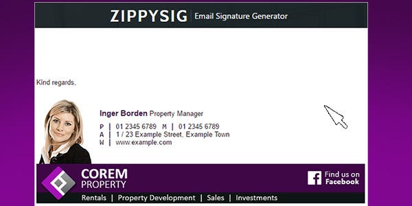
Are you looking for a way to get more traffic to your site? A great way to increase your traffic is by including website links in your email signature design footer. Links to your website can not only increase your traffic but can be a great way to optimise your marketing conversion funnel.
19. Optimise your email for mobile
Developing a mobile-friendly and responsive email signature is a great way to support your customers on multiple devices. Ensuring that your marketing emails are optimised for mobiles can help your readers clearly read your information.
20. Celebrate the seasons
Incorporating an extra element in your email signature design that’s tailored to a recent event or season can ensure that you are staying relevant to your readers. Wishing your clients a great holiday, such as Easter, Christmas or Thanksgiving, adds a more personal touch to your emails.
Are you looking for a graphic designer?
Hiring a graphic designer can be a great way to create stunning designs for your logo, business card, letterhead or email signature! Simply post a project on Freelancer and you'll receive bids from our talented experts in just seconds!