What first pops into your mind when you think Coca Cola, Kellogg's and Cartier. The stunning cursive lettering in their logotypes right?
If you're launching your first business, you'll also want to create a logo that you can be proud of.
You'll want something unique and tailored to your business, right? Something that makes your business stand out amongst the rest.
And there's nothing more unique, and nothing that packs more of a punch than putting together your own cursive lettering from scratch.
With the help of one of our top freelancers nata01, we’ve put together this guide on how to make your own cursive lettering in Adobe Illustrator.
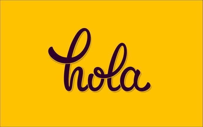
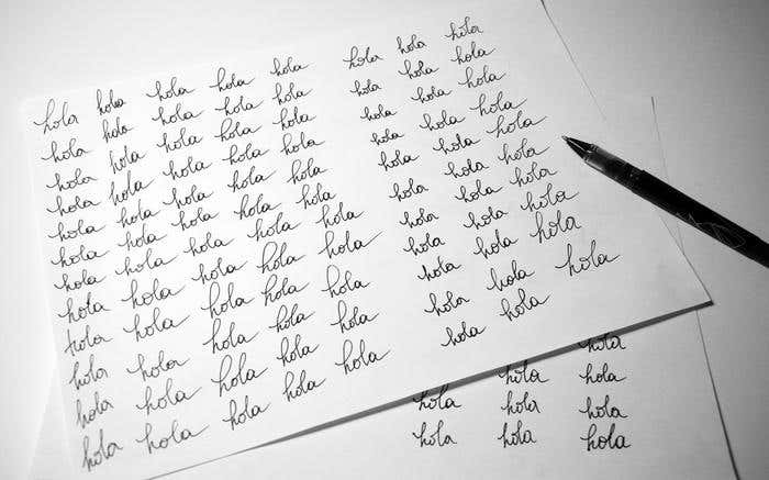
To get a really good feel for the word or phrase and the way that I wanted to represent it, we painted the word out a few dozen times on a piece of paper.
PRO TIP: Do this over and over in order to feel the flow of the letters, until you're satisfied with the positioning of each of the letters in the word or phrase.
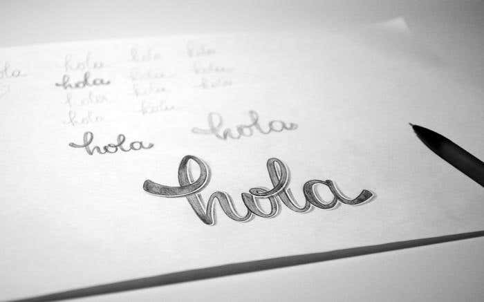
PRO TIP: Think about kerning, tracking, and any flourishes you want to add to your lettering.
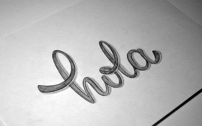
You need to scan the image in order to vectorize the design. You can do this using either a scanner or even an iPhone camera. You just need to ensure that if you are taking a photograph that it is from an orthogonal angle which is important in order to avoid geometric distortion.
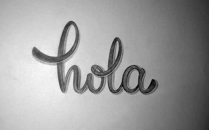
This is the delicate and detailed part. You need to start tracing the outline of the letters with the Pen tool.
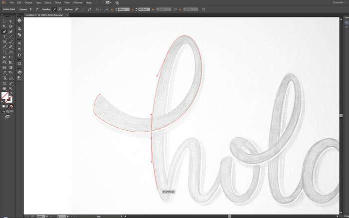
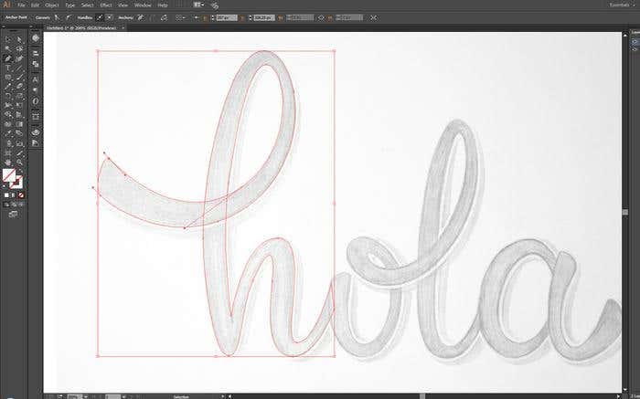
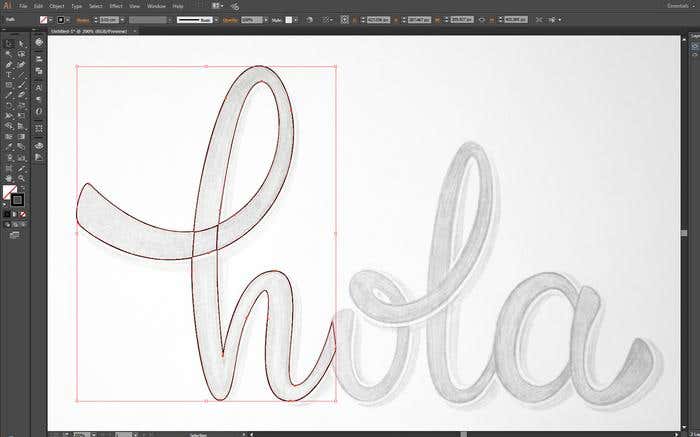
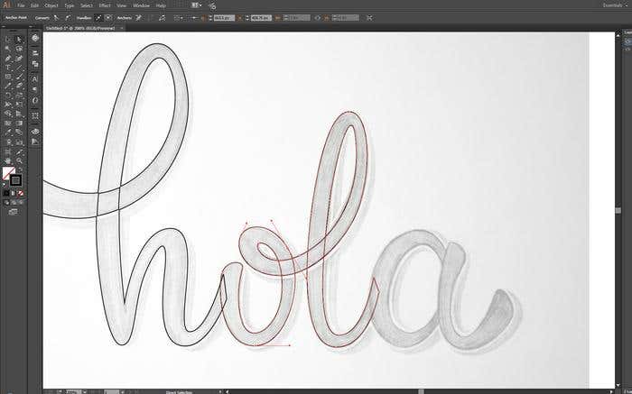
While handwriting is imperfect, professional lettering can’t be. Because you may choose to use some of these letter combinations for other words later, the in-strokes and out-strokes need to be as standardized as possible. Otherwise when combined with the other cursive letters they won’t match up and join together property. And the flow will be interrupted.
PRO TIP: Even if you initially don’t think that you’ll use these letters for other projects, it’s still best to try and standardize them just so you get into the habit.
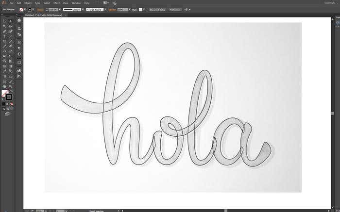
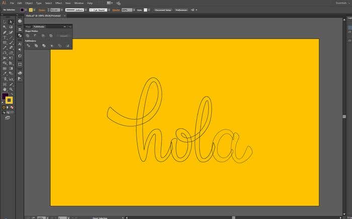
PRO TIP: Remember that every time you make changes save a copy so that if you make a mistake you can always revert back to a previously saved version.

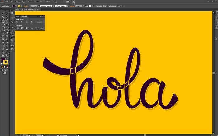
Use gridlines to help you to see the height of each letter in relation to the others. It is important that the letters are consistently the same height.
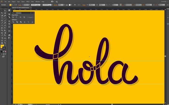
If you choose tilted or straight all the letters should take that style. It can look messy and inconsistent if some of the letters are tilted and some are straight. This is particularly important if you are going to use these letters in other projects where they may be connected to new letters. Consistency is key.
For this project, we chose to tilt it slightly to the right. This also means that we needed to adjust the shadow slightly. This can be done using the Transform function.
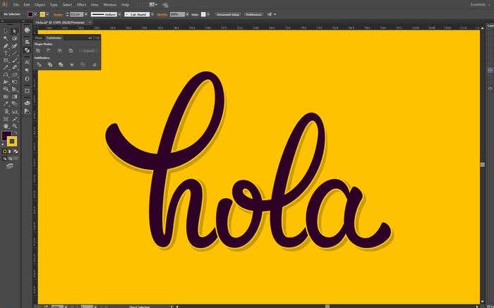
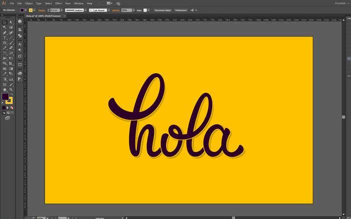

Whew! That was quite a process. By now, you’re probably created over twenty different lettering versions of your word. You’ve seen it with a swoosh, without one; with a flick here and a flick there.
Even once you think you’re finished - walk away! Take a break and don’t look at your design for a few hours or even until the next day. You will find that after taking a break, when you return with some fresh eyes, you’ll be able to see any mistakes and correct them!
Got a big project that needs some custom cursive lettering?
That was just the basic stuff. If you have a branding, t-shirt design, or advertising project that requires some curisve lettering or an entire font to be designed then look to Freelancer.com. With thousands of the best graphic designers from around the world, you’ll be sure to find the perfect cursive lettering expert for your business. Post a project now, and receive bids within minutes!