We may only be mere months into this year, but it seems like we already know the trends that are taking over 2018 – especially in website design. Part of the draw of digital destinations is that they can change at the drop of a hat – a new image, a different layout, a fancy animation – heck, even a new logo.
While it may seem daunting to keep up with every new trend – especially when some leave as quickly as they came – it may be worth your while to implement some design elements that have a bit more longevity AND may increase things like conversions, click-through rates (CTR) and positively influence the overall brand identity.
The idea of staying ahead of the curve goes double for freelancers. In-house designers or those at a design agency will likely have a large team and several departments influencing any one design’s functionality, layout, content and buzzy elements – not to mention, a lot more people looking out for popular trends.
However, most freelancers work on a project-to-project basis, and often see a lot more control over the creative. This means that having a strong grasp on what’s hot and what’s not is even more important.
Luckily, we rounded up the website design trends that you should keep on the forefront of your mind during every website design project. Each one of these is bound to see plenty of return in captivating consumers and boosting bottom lines for all of your clients, if implemented properly.
1. Bold Colors
While cozy hygge and simple designs dominated every lifestyle corner in 2016 and 2017, 2018 has welcomed a new era of big, bold personality through hues. Lots of them.
Maybe it’s the need for individuality or a throwback to the ‘80s and ‘90s (which we all know are also making a comeback) but exciting colors are likely to be everywhere, so it’s in your favor to jump on the bandwagon.
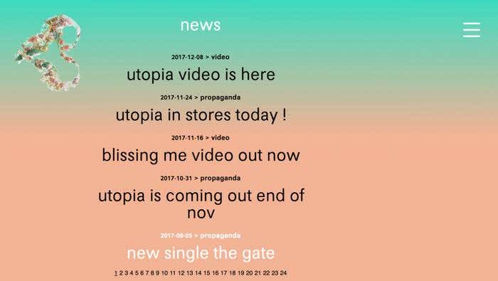
You can actually customize the way you use bold colors to fit your brand. Maybe they’re just an accent on the page, or a redesigned logo. Perhaps you incorporate them into a stunning geometric pattern. Or, you can go the way of Bjork (yes, that Bjork) and blend unexpected colors together into a gradient background, which adds a dash of elegance to colors that are screaming loudly.
2. Texture and Depth
Users want more than a two-dimensional design, and an easy way to rectify this when you’re confined to a screen is through the appearance of texture and depth. Try drop shadows on buttons, images and bold fonts to make them pop.
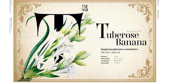
Or, incorporate tiny designs to make texture, like Japanese flower shop Taji Maji. They created a vintage background that strongly resembles parchment paper. Not only does this element catch visitors’ attention, but it adds a certain je ne sais quoi to the unique website design, which is formatted like an antique book that we can flip through.
3. Asymmetrical Layouts
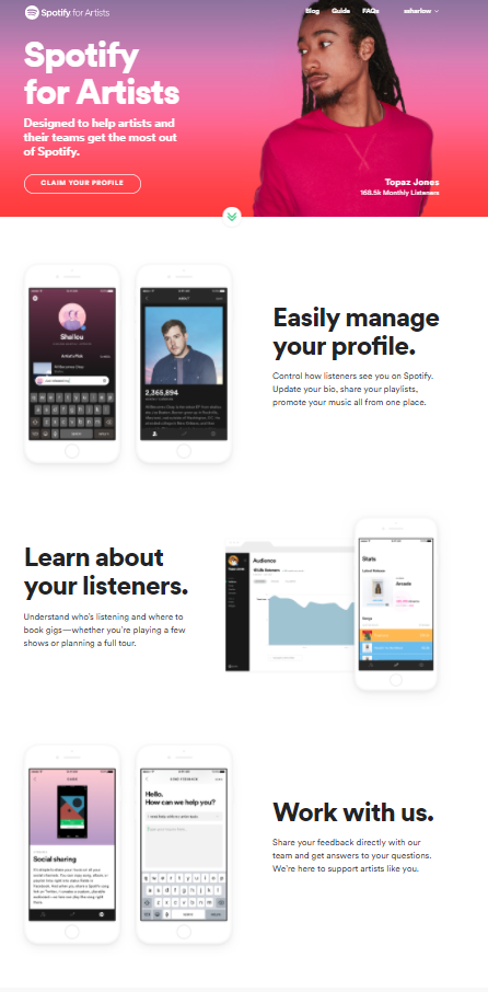
Playing off the need for more personality, layouts are changing up, too, so say farewell to the days of perfectly proportioned grids. Instead, feel free to move your content around, cut your page diagonally instead of horizontally or vertically, or even do something as simple as alternating your text and images like Spotify. Simple adjustments that go against the grain will hold a user’s attention while simultaneously communicating your message.
4. Creative Typography
Fonts can evoke emotional and psychological responses in viewers, so whether you’re creating a custom type or choosing from one of the thousands out there, it’s important to keep both your audience and the content at hand in mind. These responses can be based in historical connotation – such as the immediate association of art deco font with the roaring 1920s – or conditioned affiliation – such as a handwritten script with an intimate note.
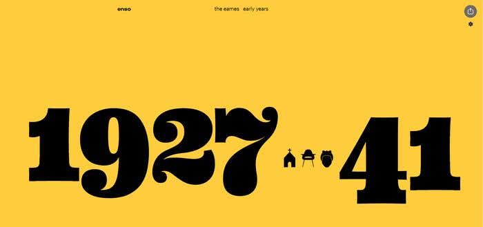
The Eames by Enzo Magazine uses a bold serif font in contrasting colors to showcase their creatively-scrolling website, which details the life and works of two science education pioneers. This excellent example displays both the time period they lived in while simultaneously appealing to bold trailblazers who may identify with them personally.
5. Mobile-Friendly Design
With giant smartphones and 4G everywhere, it’s easy to understand why mobile phones accounted for almost 50 percent of Internet traffic by February 2017. That being said, with the world wide web being accessed on half of all visits, its imperative to invest in mobile from the get-go – not as an afterthought.
Your best bet would be to create a cohesive mobile identity that meshes with your desktop version perfectly, creating a seamless experience for users, no matter where they are. Walmart is an excellent example of mobile done right. Prominent search, easy navigation and small-yet-readable banners great users upon arrival. From there, consumers can easily complete a purchase without any snafus or confusion on a medium that strongly resembles the full-blown version.
6. Playful Animations
We all know that users prefer video as their choice of media over anything else. However, videos can be both time and money-consuming, making it tricky for many companies to pull off. Enter: animations. These smaller movements take up less time, less money, less website real estate, and can still engage users more than your average image.
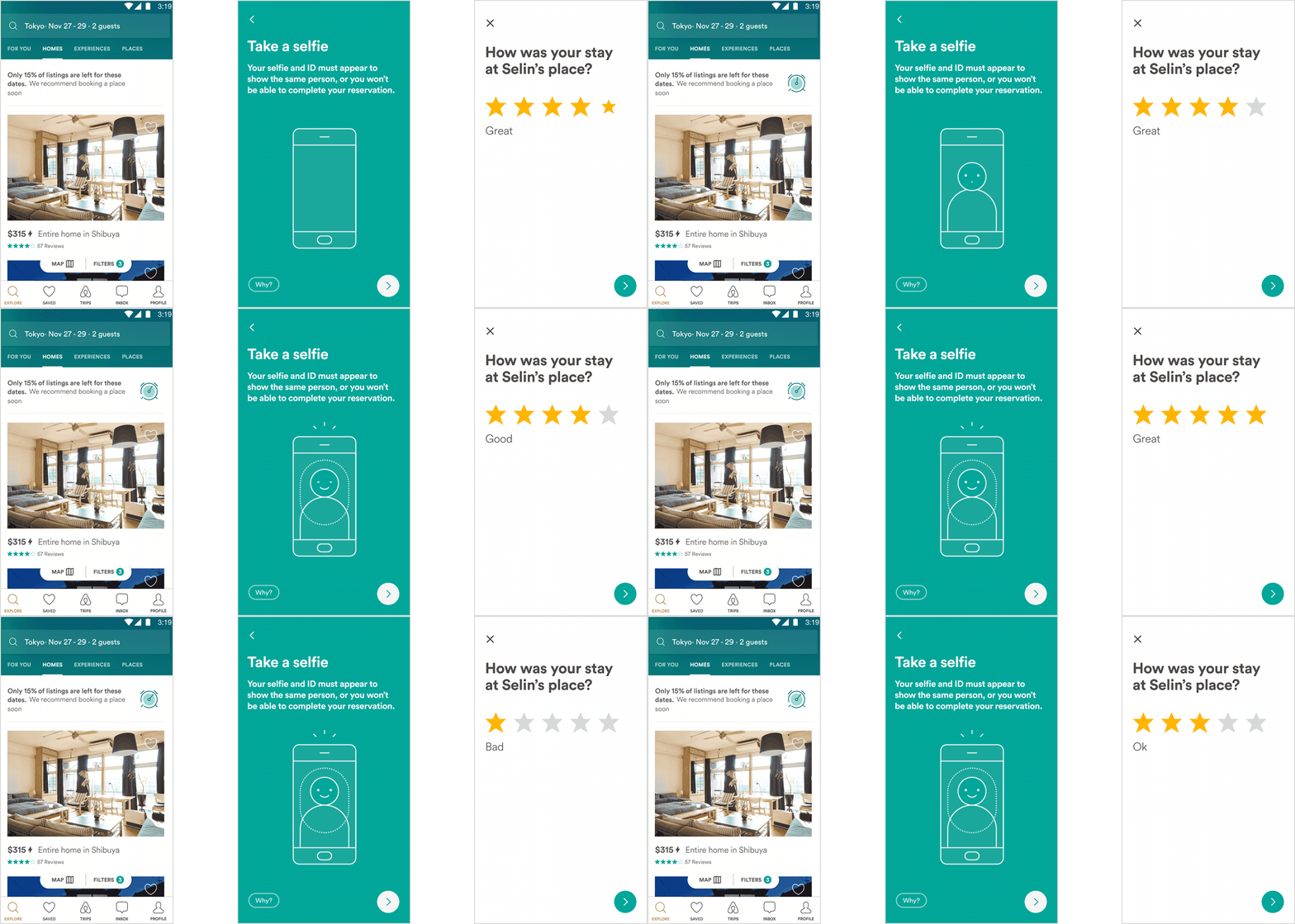
Airbnb’s app Lottie renders After Effects animations in real time, creating engaging movements that they – along with brands such as Instacart and Uber – have utilized on their apps and websites. While subtle, these tiny animations add a bit of personality that alleviate painful loading times and draw attention to important information and calls to action.
7. Micro-Interactions
A strong user experience isn’t just intuitive navigation (although that’s important, don’t get me wrong!). So much more goes into ensuring your users have a pleasant time while visiting your website – one of which being micro-interactions.
A micro-interaction – and it’s extremely similar relative, the micro-mini interaction – exist to give confirmation and communication to a user. This is extremely helpful on websites that require a lot of Internet interaction, such as a social networking site, or foster e-commerce actions and checkouts, because it saves time and energy without frustrating or boring the user.
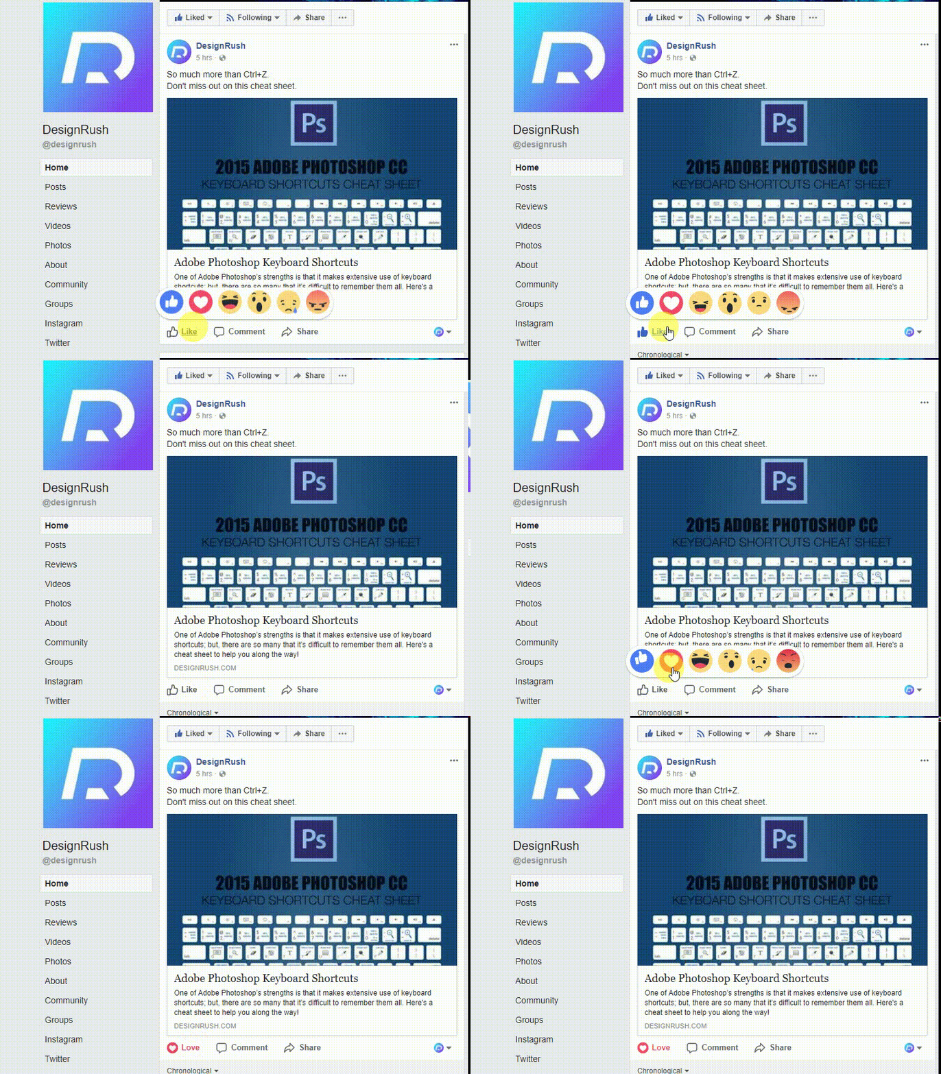
A strong example of a micro-interaction is the Facebook “like” button. After you click like (or love, or wow…) the “like” button turns a hue that corresponds to the emotion you reacted with. This is a micro-interaction – without that communication from Facebook, you would be somewhat unsure if clicking the button was actually successful.
8. Artificial Intelligence
Artificial intelligence isn’t just Siri and self-driving cars! Instead, this technology trend is taking over all facets of life – website design included! But don’t fret – incorporating AI into your website design isn’t as scary as it seems.
Plenty of chatbot integrations can automate customer service conversations, such as BotSociety. What’s more? You can even utilize AI website designers like Molly from The Grid and Firedrop. These programs use machine learning to determine what your consumers would like to see and how, then create a design from there.
9. Minimalism
If bright and bold (see no. 1) aren’t quite your think, tried and true minimalism may be right up your ally. While creative colors may ooze personality, there’s something to be said for a brand and its products just, well, speaking for themselves. Plus, you know what your mom always said – less is more.
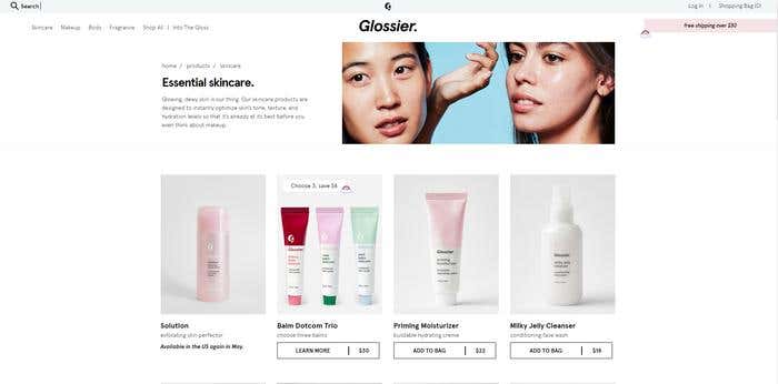
What’s better? Often times, plenty of white space and a streamlined, minimal aesthetic communicate the brand’s mission more than any ‘80s color palette ever could. Take Glossier for example. The skincare and makeup company – which prides itself on less is more in its consumers daily routines – has consistently clean design, from its logo to its package design to its website. This minimal website may pop with bright images of models, but overall, its delicate design and organized grids show users everything they need to know from the get-go.
10. Accessibility For All
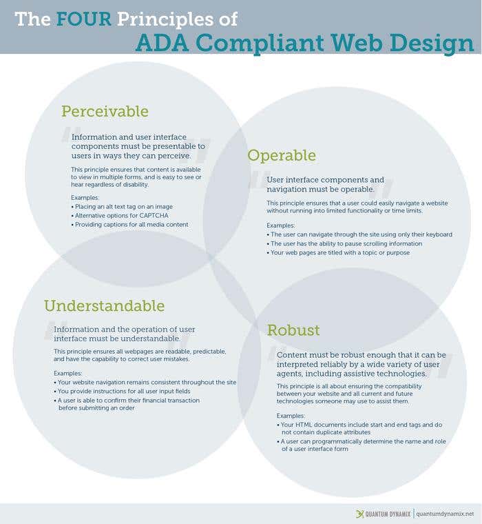
In late 2017, the Americans with Disabilities Act (ADA) mandated that all websites up their standards to ensure every website is accessible for all people. Sounds nice, but for those of us that aren’t familiar with nitty gritty details, that doesn’t really break it down into easy-to-understand terms.
Ultimately, all websites fall under a section in the act called 508 (which includes other various technology and communication mediums). Started on January 18, 2018, they had to implement four prongs of ADA compliance on any page updated after that date.
The good news? You don’t have to back track on anything you designed and pushed live prior to then. But you DO have to pay special attention to everything you make going forward.
According to Quantum Dynamix, ADA compliant improvements include captions for all media content. Alt text tags for images, keyboard-only navigation options, and unique start and end tags for HTML documents.
Conclusion
All in all, creating a stunning website design that’s both trendy AND stands the test of time as a freelance designer is easier than you think. Just keep in mind the points below as you work with your clients, and you’ll be sure to find the trends that suit their needs!
-
Use bold colors in unique layouts – but know when to go minimal, too.
-
Add texture and depth with subtle patterns and drop shadows.
-
Creative fonts and typography can communicate emotions and information well.
-
Don’t forget the importance of mobile-friendly design.
-
Playful animations and micro-interactions will engage users.
-
Incorporate AI elements.
-
Ensure your new creations are ADA compliant.
